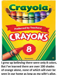
 When I was first learning how to color in 1st grade, my art teacher taught us about red, orange, yellow, green, blue, purple, black and white. Pretty much all the colors I’ve needed ever since. Then I got my first box of 64 Crayola crayons. It blew my mind. So many colors I had never imagined. One called Reddish Orange. Another one called Orangish Red. And Indian Red, which I could not in clear conscience draw with until they renamed it Native American Red.
Recently I learned that Crayola has actually retired 34 colors – including Lemon Yellow, Teal Blue and Thistle. Did you know that for the rest of eternity there will never be anything drawn in either Burnt Umber or Magic Mint? And yet for reasons unfathomable to the normal brain, they continue to crank out that annoyingly wimpy color, Periwinkle.
They’ve replaced the retired colors with nouveau-sounding ones like Asparagus, Bittersweet, Inch Worm and Tumbleweed. What the hell color is Inch Worm?
It’s hard enough for my 8-color-palette brain to grasp the difference between Sage and Mint. More astonishingly, for all the colors in Crayola’s 64-color box, I’ve discovered there are literally hundreds of shades of white. When did that happen?
My artist wife and I were discussing what color to paint her art studio. Apparently, it’s important that artist studios be painted in neutral tones like white – I have no idea why. I had suggested Bubble Gum Pink, but apparently that’s not quite neutral enough pour ma femme artiste. No, she insisted, it had to be a shade of white. A shade of white? Hmmm….
So we went to the paint store to buy some cans of white paint. Figured we’d be in and out in five minutes. Oh, how wrong I was. Because on the Sherwin Williams paint charts, you can buy just about ANY shade of white paint imaginable – or unimaginable. But there is one shade you won’t find anywhere: plain white.
Just how many shades of white are there, you ask? Well, according to Kevin, the paint store helper, there are – and I am just approximating here – 493 – 494 if you include Whitish White (which, in addition to being an actual color, also accurately describes most of my dance moves).
Kevin showed us the endless sea of white paint swatches. I quickly realized I should have brought my camping gear, because we were going to be here for a long, long time. I’ve seen flowers blossom and die in less time than it took for my wife to decide which shade of white was best for her art studio.

You see, what shade of white to paint my wife’s art studio was a decision that we simply had to get right. So she asked Kevin to show us a few color choices. The following is a tiny sampling of white color options we were shown:
Eggshell, Linen, Pearl, Baby Powder, Ghost White, Cream, Ivory, Seashell, White Smoke, Navajo, Bisque, Blond, Papaya, Bone, and Fog Mist were just the tip of the Iceberg (which by the way is color #273 on the Sherwin Williams white paint chart).
But Kevin was just getting started. He also showed us White Pebble, Picket Fence, Dove Wing, Old Lace, Corn Silk, Arctic White, Wimbledon, Vanilla, Floral White, Chablis, Latte, Magnolia, Dutch White, Flax, and Sea Cloud.
Are you really still reading this list? I would have bailed after Baby Powder. Then Kevin showed us more shades of white paint: Napkin White, Winter Mood, Victorian Pewter, Oatmeal, Scotland Road, Champagne, Pale Smoke, Macaroon Cream. Sea Salts, Rag Paper, Cascade White, Waterfall Mist, Soft Muslin, Beryllium, Bismuth, and Tungsten.
Okay, in full disclosure, the last three weren’t shades of white. They’re actually elements on the Periodic Table. I just wanted to be sure you were still paying attention. All these actual paint colors have one thing in common: They all looked WHITE to me. OK – call me a white paint racist.
After what seemed like hours spent pondering the color options (because that’s how long it was) my wife narrowed the list down to White Chocolate, Snowbound and White Heron. Personally, I had my heart set on Psychedelic Banana, but she stopped asking for my input after I suggested we just throw a dart and see where it lands.
In the end, my wife settled on White Heron. She said something about it having the right balance of saturation and tonality to offset the coolness of the ambient afternoon light blah, blah, blah – frankly, I’ve no idea what she was talking about. She lost me at “right balance” (which I thought was a yoga move). She asked me how I felt about her decision, and there was only one correct answer, of course: “Excellent choice, dear!”
Once we finished painting the walls, my wife started having second thoughts. Perhaps she should have gone with Vanilla Milkshake – or Glacier White. I offered her $100 not to set foot in that paint store ever again. She took the cash and accepted that White Heron would do.
Whatever shade of white it is, it looks fine to me. Of course, I can no more tell the difference between White Heron and Glacier White than I can tell the difference between a French horn and a tuba. You won’t catch me second-guessing her choice, that’s for sure. I’m just glad she didn’t choose Periwinkle.
That’s the view from the bleachers. Perhaps I’m a shade or two off base.

© Tim Jones, View from the Bleachers 2015


From someone who’s been accused of having a sense of humor that’s “slightly askew” (slightly being the polite way of saying it), you are always a shade or two off base and hilariously witty.
There of course are “shades”, then there are “tints” of the same colour.
Try white balancing a landscape photo …. when white could be any thousands of hexadecimal notations. Not with fancy descriptives like Heron White…
(I’ve seen lots of herons but never a “white one” Herons are grey, blue, black, brown, tan etc. How about picking and Egret white instead. At least they are pretty “white birds”).
Back to hexadecimal whites how about choosing #e3e0d8; as it has gold slant or the suggestive and stimulating #e2e3d8 with a green tint. Augh ….. then there are the greens.
Good post Tim always fun.
I just painted an exterior wall white. The paint was called WHITE. I am not making this up. It took me all of one minute to buy it and get out of the hardware store. I did not consult my wife. Now that the project is done I am satisfied that the wall is sufficiently, well, white.
As for your selection. It was incorrect. Picket Fence is clearly the ideal choice.
I have always said that “white is white”. Thanks for clearing that up for me.
I’m rather fond of periwinkle. 🙂
The things we do for love.
Here’s a list of songs for you, Tim:
Whiter Shade of Pale – Procol Harum
Nights in White Satin – Moody Blues
White Girl – VKTMs
White Christmas
White Wedding – Billy Idol
White Lightning – George Jones
You could always catch the Average White Band or listen to the Beatles’ Album, because you are “Pretty Fly (for a white guy)”…..
Play That Funky Music, White Boy – Wild Cherry