 As someone who pretends to be a writer (translation: I have a laptop and opinions), I take the craft seriously. I’ve studied the greats: Hemingway, Twain, and the guy who writes the fortunes inside fortune cookies. I’ve learned that before you write a single word of your Great American Novel (or 600-word scathing Yelp review of your dentist), you must first answer one critical question: What font should I use?
Now, I know what you’re thinking: “Who cares? Just use Times New Roman and move on with your life.” Well, that’s where you’re wrong, my friend. Times New Roman is a fine font if you’re writing a term paper or a ransom note, but it lacks pizzazz. Fonts speak. They have moods. They have vibes. Arial says, “I’m professional but still down to party.” Courier New says, “I miss typewriters and the 1940s.” Wingdings says, “I’m off my meds again.”
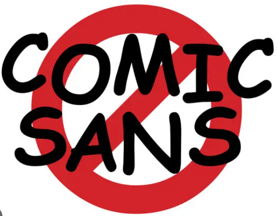
But there’s one font – one font – that has been mocked, maligned, and metaphorically tarred and feathered more than any other: Comic Sans.
Ah, Comic Sans. The font equivalent of dad jokes and black knee-high socks with sandals. It has been called childish, chaotic, ugly, unprofessional, and the “Crocs of typography.” People hate Comic Sans with the kind of passion usually reserved for bee stings and people who clap when the plane lands.
It’s been the target of internet rage for decades. Entire websites have been devoted to its humiliation. Twitter (now known as “X” because apparently we’re all in an Elon Musk fever dream) had thousands of tweets from typographic vigilantes who wanted to burn Comic Sans to the ground and salt the earth behind it. There was even a group that created something called the Ban Comic Sans Manifesto, which sounds like a political rebellion but with more kerning (look it up).
The hate runs so deep, I wouldn’t be surprised if someone lost a job because they handed in their resume in Comic Sans. (Though to be fair, if you’re submitting your resume in Comic Sans, maybe unemployment is a growth opportunity.)

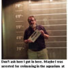
Elizabeth in Accounting just got the office memo about the company’s Holiday Office Party. She was going to go, until she noticed the entire memo was written in Comic Sans. Just as well. Elizabeth is no fun at parties.
But here’s the thing…What did Comic Sans ever do to you, buddy? It’s a font. Just a font. It’s not like it kicks puppies or uses speakerphone in public. It doesn’t tailgate you on the freeway or mow its lawn next door at 7 in the morning. It’s just trying to live its best sans-serif life, and the world keeps throwing shade harder than a solar eclipse.
Let’s look at the origin story. Comic Sans was created in 1994 by a Microsoft designer named Vincent Connare. (Yes, someone willingly admitted to creating Comic Sans. And no, he’s not in witness protection.) It was originally designed for use in comic book-style speech bubbles in software designed for children.
So naturally, grown adults took this playful font for kids, used it to make funeral invitations and legal documents, and then blamed the font for looking “immature.” That’s like blaming a teddy bear for not fitting in at a corporate board meeting. Comic Sans wasn’t designed to look like a Wall Street banker. It was meant to look like a cartoon balloon with dreams. A bubbly little font that just wants to make your PowerPoint presentation feel like a 2nd grade birthday party. Is that so wrong?
But no, the world said, “You’re not Helvetica. You’re not Calibri. You’re not even Gill Sans. You’re the Nickelback of fonts.”
Personally, I think we’re being a little harsh. It’s not Comic Sans’ fault that Karen from HR used it on the company-wide sexual harassment policy memo. Or that your kid’s third-grade science fair trifold looked like a ransom note from Elmo. That’s user error.
The truth is, Comic Sans is inclusive. It’s the golden retriever of fonts – friendly, approachable, and maybe a little bit goofy, but it means well. It’s not trying to impress you with its serifs. It’s just trying to make your dentist’s reminder postcard a little less terrifying.
And before you throw stones from your Adobe Creative Suite, let’s remember that design trends are like bell bottoms – they all come back eventually. Today we mock Comic Sans. Tomorrow, you’ll be wearing Crocs with socks while reading a self-help book in Papyrus font.
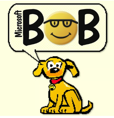
Fun Fact: Comic Sans was created by Microsoft designer Vincent Connare in 1994 for a program called Microsoft Bob, a user-friendly interface for young children. In focus groups, they later discovered that even DOGS can’t stand the font.
Let’s take a moment to consider how Comic Sans must feel. Other fonts get to be on wedding invitations, luxury hotel signage, and the credits of Netflix documentaries. Comic Sans gets stuck on passive-aggressive PTA flyers and the occasional ironic meme.
It’s the Rodney Dangerfield of typefaces. No respect.
So, I say it’s time to end the font-shaming. Let Comic Sans live! Let it frolic freely across the digital fields of Word docs and email signatures. Let it brighten the spreadsheets of our lives with its curly optimism.
And if that doesn’t convince you, just remember this: somewhere out there, a young graphic designer just got berated by their boss for using Comic Sans on a promotional poster. And they’re weeping into their pumpkin spice latte. Don’t laugh at them, you monster.
That’s the view from the bleachers. Perhaps I’m off base.
 PS: If you enjoyed this week’s post, let me know by posting a comment, giving it a Like or sharing this post on Facebook.
Subscribe to my View from the Bleachers YouTube Channel and request notifications to see my latest videos. And check out my latest book, THE SECRET TO SUCCESS AND HAPPINESS (is Something I Have Never Figured Out. I’m Open to Suggestions).


I appreciate your insight on fonts, especially given my background in graphic design. You were not off base. You hit another home run, you Font Monster
Stacey
The golden retriever of fonts. Brilliant!
Poor Comic Sans. It means well, as do you.
I read recently that Comic Sand is one of the best fonts for accessibility — ie readability — especially for people with dyslexia.
https://www.creativebrief.com/bite/voices/defence-comic-sans-global-accessibility-awareness-day
Thanks for this one. I use Comic Sans bold as my standard font.
Thanks, Tim, for coming to the aid of Comic Sans. I like to think of it as the little font that could. I really like it’s unpretentious accessibility. It doesn’t try to be something that it’s not, doesn’t take itself too seriously and gets the job done with a puckish smile and slightly raised eyebrow that make all the other fonts wonder what’s it’s really up to. I wouldn’t use it for a written eulogy, unless of course that eulogy was for Mel Brooks (Mel would understand). Always enjoy your outlook on things, Tim.
Just you wait ‘enry ‘iggins – AI will invent Comic Serif.